Canvas App Guideline
Naming conventions
When naming objects or variables, consistency is crucial. One widely used convention is camel case, which involves the following steps:
- Start with a lowercase prefix.
- Remove all spaces from the object or variable name.
- Capitalize the first letter of each word after the first. For example: the object Combobox can be named as "cmbox" by applying a lowercase prefix and removing the spaces. (cmboxPersonPicker - describes what the object does)
By following this naming convention, you can ensure consistency and improve code readability and maintainability.
Components
| Object name | Object prefix examples |
|---|---|
| Combobox | cmbox |
| Label | lbl |
| Text | txt |
| Gallery | glr |
| group | grp |
| icon | ic |
| image | im |
Variables
Be descriptive of the variable's function.
Use different prefixes for global and context variables.
The name after the prefix should indicate the intent or purpose of the variable.
Multiple words can be used without any special characters, and the first letter of each word should be capitalized.
Global variable example: varCurrentUser
Local variable example: varlocPersonPickerVisibility
Screens
Choose names for screens that reflect their purpose, aiding navigation in complex scenarios. Example: Home Screen
Collections
- Be descriptive of the collection's contents.
- Prefix collection names with "col."
- Begin the collection names with a lowercase "col" prefix and capitalize the first letter of each word in the name.
Example: colMenu
Following these guidelines ensures clear and consistent naming, which helps with code organization, readability, and easier navigation within your application.
Optimalization of your App's performance
Place your code
OnStart:
The OnStart property is executed when the user starts the app. It is typically used for the following purposes:
Retrieving and caching data into collections using the
Collectfunction.Setting up global variables using the
Setfunction.
This formula is evaluated before the first screen appears. ⚠️However, it's important to note that excessive use of the OnStart property can lead to performance issues during app loading. It is advisable to include only the necessary logic here. For example, you can collect only those collections that the app will use on the first screen. If there are pages that the user will rarely navigate to, you can set up the collections and variables behind a button or using the OnVisible property of the screen.
StartScreen:
The StartScreen property is where you build the logic to display the first page of the app. It allows you to define which screen object to show based on specific logic.
For example:
If(Param( "AdminMode" ) = "1", AdminScreen, HomeScreen )
In this example, the StartScreen property returns the screen object to be displayed first based on the provided logic. If the "AdminMode" parameter is equal to "1", the AdminScreen is shown; otherwise, the HomeScreen is displayed.
By using these properties effectively, you can control the initialization of your app and determine the initial screen to show, enhancing the user experience and overall functionality of your application.
Delegation Issues
Delegation becomes relevant when working with large data sets in Power Apps. Delegation refers to the process of transferring data processing and filtering operations to the underlying data source. Power Apps has specific limitations on the amount of data it can efficiently handle and process.
By default, Power Apps imposes a limit of 500 records (which can be increased to 2,000 records) for non-delegable functions or operations. You can adjust the delegation limit by modifying:
- Data Row Limit setting found under the General tab in Settings.
Delegable functions and operations can be offloaded to the data source, enabling efficient task handling. However, non-delegable functions cannot be transferred to the data source and must be processed within the app itself.
The delegability of functions depends on the data source being used. To understand which functions can and cannot be delegated, you can refer to the delegable and non-delegable function list provided.
⚠️While there are techniques to work around the limitations and pull more than 2,000 records into the app, it is important to consider the potential performance issues involved. It is advisable to be mindful of performance considerations when handling a large volume of data in Power Apps.
By understanding delegation and its implications, you can make informed decisions when designing your app's data processing and ensure a balance between functionality and performance.
How to use controls for achiving better performance
One effective way to optimize performance is by utilizing the gallery control as a navigation menu. By using fewer controls, you can achieve better performance in your Power Apps.
The gallery control is designed to display multiple records from a data source, with each record containing various types of data. Within the gallery control, you can configure separate controls for each data field by customizing its template. The template represents the layout and design of the controls within the gallery and is displayed as the first item.
To create a navigation menu, you can create a table within Power Apps and insert buttons or icons as controls. These controls can be placed inside the gallery to represent different navigation options.
By leveraging the gallery control, you can efficiently display multiple records with their associated data and customize the appearance of individual controls within the gallery. This approach allows you to create a visually appealing and interactive navigation menu within your Power App while optimizing performance by utilizing fewer controls.
For Example:
ClearCollect(
        colHome,
        {
            ID: 1,
            Name: "Menu 1",
            Icon: Icon.AddLibrary
        },
        {
            ID: 2,
            Name: "Menu 2",
            Icon: Icon.ListScrollWatchlist
        },
        {
            ID: 3,
            Name: "Menu 3",
            Icon: Icon.Calculator
        }
)
You can use this collection within the gallery and insert a button control. In the OnSelect property of the button, you can use the Switch function based on the ID column value to navigate the user to different screens.
Switch(
    ThisItem.ID,
    1, Navigate(Screen1),
    2, Navigate(Screen2),
    3, Navigate(Screen3)
)
In the above example, the Switch function is used to evaluate the ID column value of the selected item in the gallery. Depending on the ID value, it navigates the user to the respective screens using the Navigate function. For instance, if the ID is 1, it navigates to Screen1; if the ID is 2, it navigates to Screen2, and so on.
By incorporating this logic within the button's OnSelect property, you can enable navigation to different screens based on the user's selection within the gallery.
Using forms instead of lot of input controls
Using form, you can use form’s properties, as
OnSuccess,OnFailure,DefaultMode.You can also use
SubmitFormfunction, in this case you don’t have to build logic of required field. Just set it up on the datacard level and the rest will be handled the Form control.Using one icon instead of multiple icon, just changing the icon shape based on logic. On the icon of icon property, you can set which icon you would like to use. You can even build logic that this one icon changes the shape based on if or switch conditions. In this case you don’t need to use multiple icons.
Code Best Practices
Concurrent Function: Utilize the concurrent function when executing independent operations that don't rely on each other's results. This allows you to perform multiple tasks simultaneously, reducing overall data loading time. For example, fetching data from multiple data sources concurrently can improve efficiency.
Minimize Control Usage: Use fewer controls wherever possible. Reducing the number of controls in your app helps improve performance. Streamline the design by using control layouts effectively and eliminating unnecessary controls.
Effective Use of Variables:
- Local or Context Variable: Utilize local or context variables using the
UpdateContextfunction. These variables store temporary data within a specific context, improving data manipulation efficiency. - Global Variable: Implement global variables using the
Setfunction. Global variables store data accessible across screens, allowing for efficient data sharing and manipulation.
- Local or Context Variable: Utilize local or context variables using the
Switch Function vs If Function: Choose the appropriate function based on the scenario. The
Switchfunction is suitable for comparing input values against multiple conditions based on equality. If you need to compare an input against a range or list of values, the If function is more appropriate.Filter Function vs Lookup Function: When retrieving a single record from a data source, prefer using the
Lookupfunction instead ofFirst/Filter. The Lookup function is designed specifically for returning a single record, resulting in faster response times compared to usingFirst/Filterfor this purpose.With Function: Utilize the
Withfunction to optimize formula efficiency. This function evaluates an argument and retains the returned values as a record, enabling you to reference them multiple times within the formula. This avoids redundant calls to external functions.
Example:
With(
    {wUser: Office365Users.UserProfile(User().Email)},
    "Welcome " & wUser.GivenName &
    "! Your department is " & wUser.Department &
    ", and your Company Name is " & wUser.CompanyName
)
Responsivity:
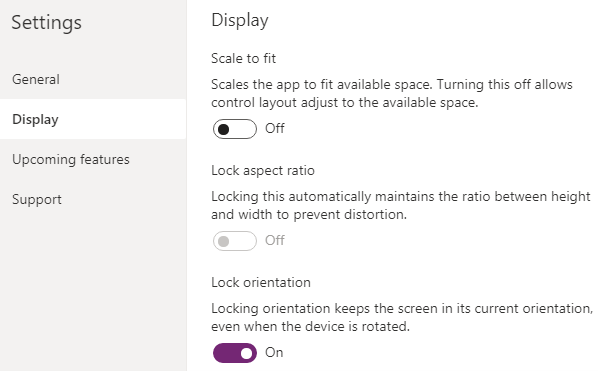
- To build responsive app, the Scale to fit option needs to be turned off.
To create responsive design the following properties of controls will be used:
- X
- Y
- Width
- Heigh
You can use parent control’s properties by using the following formulas:
- Parent.Height
- Parent.Width
- Parent.Size
This means that the child control will adopt the parent’s height and width.
When you start to use formulas behind the control’s X and Y properties, you should avoid dragging controls, because the formulas will be overwritten if you drag the control in the canvas editor. The same applies with the control’s width and height. Do not change the control’s width and height by dragging the controls.
App’s SizeBreakPoints:
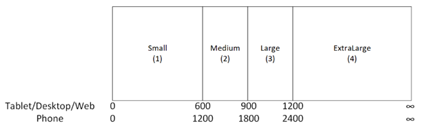
By costumizing the SizeBreakPoint, you can define the Screen Size (when it is Small(1), Medium(2,), Large(3), ExtraLarge(4)).
You can referenc the Parent.Size and compared it to the Screen.Size
Parent.Size >= ScreenSize.Medium
See more information:
https://powerapps.microsoft.com/en-us/blog/new-properties-for-responsive-canvas-apps/
The easiest way to achieve a responsive layout is by using Container control.
See more information:
https://learn.microsoft.com/en-us/power-apps/maker/canvas-apps/build-responsive-apps
Tips and Tricks
- Select all DatacardValues and DataCardKeys in Form to mass change them:
- Select the form
- Change Layout from Horizontal to Vertical (or vice versa)
- Hit once the Undo icon
You can deselect the ones you don't want to be selected using the CTRL-Key while clicking.
- You can run
OnStartproperty of the App to imitate the load of the App and run the logic behind the App load. You can do it by hovering over the App object in the Tree view pane, selecting ellipsis (...), and then selecting Run OnStart. - Same can be done with
StartScreenproperty. - Use of Format Text feature: for better code review